OX6:Gui Theming Description: Difference between revisions
m (Added new branding section to custome headline area) |
|||
| Line 173: | Line 173: | ||
You will have to re-apply these changes on each update you install. | You will have to re-apply these changes on each update you install. | ||
== Branding | == Branding, customize the headline area == | ||
If you enabled the area with your logo on top of the page you may want to add additional html components like own buttons, links or additional images. | |||
This short how-to gives you an small example to add some text links and an additional image to this section. | |||
First create a new UI plugin like described in the article [[GUI Plugin Development|Gui_Plugin_Development]]. Open the register.js of your plugin and add this example code: | |||
//selects the branding div and append additional html elements using jQuery | |||
jQuery("#branding").append( | |||
jQuery("<div/>").css({ position: "absolute", right: "10px", lineHeight: "35px" }).append( | |||
jQuery("<div/>").css({ float: "right", color: "#449ccf", cursor: "pointer" }).text("Legal").click(function() { alert("Clicked on Legal") }) | |||
).append( | |||
jQuery("<div/>").css({ float: "right", width: "30px", color: "#999999", textAlign: "center" }).text("|") | |||
).append( | |||
jQuery("<div/>").css({ float: "right", color: "#449ccf", cursor: "pointer" }).text("FAQs").click(function() { alert("Clicked on FAQs") }) | |||
).append( | |||
jQuery("<div/>").css({ float: "right", width: "30px", color: "#999999", textAlign: "center" }).text("|") | |||
).append( | |||
jQuery("<div/>").css({ float: "right", color: "#449ccf", cursor: "pointer" }).text("Contact").click(function() { alert("Clicked on Contact") }) | |||
) | |||
).append( | |||
jQuery("<div/>").css({ position: "absolute", height: "35px", width: "221px", left: "50%", marginLeft: "-110px", background: "url(" + ox.gui.themePath + "img/brand_middle.png)" }) | |||
); | |||
[[Image:Example_logo_headline.png|thumb|600px|none|Example how it looks like]] | |||
As you can see you can use either use jQuery or the 'normal' document way to add DOM elements. Everything you need is some HTML and JavaScript knowlege. | |||
= Version 6.18.0 and lower = | = Version 6.18.0 and lower = | ||
Revision as of 15:13, 12 January 2011
Introduction
The Open-Xchange application allows you to create your own theme with your own colors and images. This tutorial will explain each step to create such theme.
Tools
A good tool for testing, debugging and experimenting is the Firefox plug-in Firebug. This powerful plug-in can help you to debug your CSS elements on the fly. You also require a image manipulation program like Photoshop, Gimp or Corel Draw.
Understanding CSS
The full layout of each Open-Xchange theme consists of two major parts: the CSS elements (90%) and the layout images (10%). This means, most of the theme is done in CSS. The main structure of the Open-Xchange frontend is done in HTML and combined with a CSS theme and a set of images completes the theme. The CSS elements control the look, size, position and sometimes the effect of a HTML element. If you want to change these attributes of a HTML element, you only need to define a class within you CSS file for this given HTML element. In this class, you can set the color, the size, the position and sometimes the effect of one or more HTML elements.
Some HTML elements have a fixed group of attributes which are set in a CSS file which is not part of the Open-Xchange theme. These fixed parts are required to make the layout work correct. However, you can always override these attributes in your CSS file if you want to or if you need to.
Where to start
All themes will be stored in the following directory of the Open-Xchange Server:
/var/www/ox6/themes/
Per default you will have at least two themes in this directory: a default theme and a alternative theme. The easiest way to start with your own theme is to copy the default theme with:
cp -r /var/www/ox6/themes/default /var/www/ox6/themes/[YOUR_THEME_NAME]
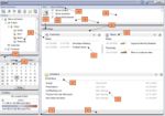
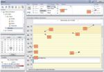
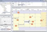
Now, you should start modifying your theme, by editing the stylesheet files in /var/www/ox6/themes/[YOUR_THEME_NAME]/css, and exchanging the images from /var/www/ox6/themes/[YOUR_THEME_NAME]/images. The following screenshots will give you an overview of the stylesheet structure, and which tags have to be modified in order to get your theme customized
Version 6.18.2
Setup description
After you have created your theme, you should make this theme available in the configuration interface for users of the Open-Xchange Server. To do that, you only have to manifest your theme in the following server configuration file, afterwards your users can select your theme:
groupware/settings/themes.properties
You will find at least two already existing themes there. Just add your new theme. We call our new theme "Mantis" which is also the path within the theme folder of the GUI.
modules/themes/mantis=Mantis
Afterwards, restart the Open-Xchange service groupware. Your users can now select your theme.
Getting started, the background and the shadow
Lets start with the basics, the background and the shadows. Open the global.css and change the background color:
body {
 background-color: #f1f1f1;
 font-family: Arial, Helvetica, sans-serif;
 font-size: 9pt;
 color:#000;
}
Save the file and reload your theme.
In this screenshot, you can see that the background is now brighter but the corners of the subwindows are still blue. These blue elements are images which provide the shadow of the subwindows. In the next step we will replace this image with a new one which fits our colors. Open the image for the left shadow which can be found here
/themes/[YOUR_THEME_NAME]/img/border/cpbody-r.png
Basicly, this image is only 4 pixel wide and infinite heigh. It doesn't matter if you cut it down to 1x4 pixel or make a 500x4 pixel version. It will be unlimited repeated. A easy way to add a shadow, is to use a gradient tool and make a 4 pixel gradient from a dark gray to a lighter gray.
You also have to add a extra line to your global.css CSS file which looks like this.
#ox-sidesplit {
 right: 1px !important;
}
Just add it to the bottom of your file.
Take your new cpbody-r.png file and copy it into the same folder and overwrite the cpbody-l.png file. Then open it and rotate it for 180°. The left shadow is the same as the right one which means you can easily copy these files.
Another quick CSS change is needed to fix some custom elements. Open
/themes/[YOUR_THEME_NAME]/css/bgimages.css
and change this line for the new created cpbody-l.png file.
.cpheader-l {
 background-image: url("../img/border/cpbody-l.png");
 background-position: 0% 0%;
 background-repeat: repeat-y;
}
The last thing you have to do, is to change the panel-switcher or sometimes called panel toggler. It is the little arrow in the upper left corner if you have closed the folder panel. You have to change the background shadow, too. The file is located here:
/themes/[YOUR_THEME_NAME]/img/border/spback.gif
You also have to make a minor change in the bgimages.css file. Add the last line to this class which reduces the right position from -10 to -8.
.sp-toggle
{
 background-image:url(../img/border/spback.gif);
 right: -8px !important;
}
At this point, you are done with all shadows and borders and the background.
Panels and bars
We start with the "module name bar" and the navigation panel. For this example, we change the background color with a image, a gradient image. Create a image you like and place it within your theme folder.
/themes/[YOUR_THEME_NAME]/img/
Now we have to add this image to our CSS files. Both bars or panels get their entries in the global.css. You can replace the existing entries with a new one.
.topHeaderBG, .topheader-color {
 background-image: url("../img/background_g.png");
}
and
div.oxTabControl {
 background-color: #dae1e6;
 background-image: url(../img/background_g.png);
 background-position: 100% 0;
 background-repeat: no-repeat;
}
You might need to change your font color for these bars in case you switched to a brighter background image or color. Both is set in the global.css
.ox-sidepanel-title {
 color: black;
}
and
div.oxTabControl td.oxTab:hover, div.oxTabControl td.oxTabLast:hover {
 background-color: #555;
}
You also might change the hover effect of the panel bar to fit the new colors:
div.oxTabControl td.oxTab:hover, div.oxTabControl td.oxTabLast:hover {
 background-color: #ccc;
}
Icons
Since version 8.18.2 the Open-Xchange GUI comes with a new icon set. The old icons where a common 16x16 pixel GIF file. The new set comes in three different sizes, 16x16 pixel, 24x24 pixel and 34x34 pixel. Right now, only the 16x16 and 24x24 pixel icons are used. However, some of the new icons still exists as a old GIF file. If you take a closer look at the folder structure, you will see that all the new icons can be found at:
/themes/[YOUR_THEME_NAME]/icons/
The old icons can be found in the folder
/themes/[YOUR_THEME_NAME]/img/
With the help of Firebug you can easily get the correct path for the icon you want to change. For this example, we changed the top navigation icons for the Open-Xchange modules like mail, calendar, contacts aso.
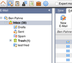
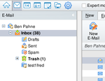
In the following screenshot, you can see the results after all changes we made so far which includes some new icons, a modified background and shadows and some new bars and panels.
Branding, get your logo into the frontend
The new version 6.18.2 comes without a branding icon or logo in the upper area like in version 6.18.1 and earlier versions. To get a logo back into the top area just follow this small tutorial.
1. Go to your theme folder e.g. themes/${name}/css/

2. Expand the file "concat.cssz" using gzip: "gzip -d -S .cssz concat.cssz"

3. Open the file "concat" using a text editor (e.g. vim concat)

4. Search for the tag '#branding'.
 Please note: Further details how-to enable the logo or how to change
 the height of the logo area, can be found in the comments.

5. After editing the file, save your work and compress it again:
 "gzip -S .cssz concat"

To test your modifications, clear your browser cache and hit the reload button of your browser.

Please note:
You will have to re-apply these changes on each update you install.
Branding, customize the headline area
If you enabled the area with your logo on top of the page you may want to add additional html components like own buttons, links or additional images. This short how-to gives you an small example to add some text links and an additional image to this section.
First create a new UI plugin like described in the article Gui_Plugin_Development. Open the register.js of your plugin and add this example code:
//selects the branding div and append additional html elements using jQuery
jQuery("#branding").append(
jQuery("
).append(jQuery("
).append(jQuery("
).append(jQuery("
).append(jQuery("
      )
).append(
jQuery("
);
As you can see you can use either use jQuery or the 'normal' document way to add DOM elements. Everything you need is some HTML and JavaScript knowlege.
Version 6.18.0 and lower
Style
Open the Open-Xchange CSS files for this changes.
The Portal Page
- <body> .background-color
- cpbottom-color
- font-color-disabled
- font-style-headline
- background-color-additional-content
- border-background-default
- font-color-default
- font-style-lable
- font-color-header
- cpheader-color
- font-style-headline
- border-color-design
- background-color-content
- font-color-header
- topHeaderBG
The Calendar Page
- font-color-disabled
- wholeDayBackground
- background-color-PMG-selection-elements
- offTimeBackground
- strokeCalendar
- sectionStrokeCalendar
- border-color-image
- font-style-big-headline
- kwSeperationBackGround
- workTimeBackground
Calendar Month View
- wholeDayBackground
- appointmentTEMPORARY
- appointmentRESERVED
- appointmentABSENT
- appointmentFREE
- workTimeBackground
- offTimeBackground
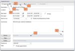
New Appointment
- background-color-additional-content
- font-color-disabled
- border-color-design
- border-color-content-default
- background-color-content
- font-style-lable
- background-color-default
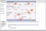
New Appointment Series
- popupHeaderBackground
- popup-header
- greywrapper
- background-color-additional-content
- border-color-design
- popupBackground
Calendar Week View
- border-color-design
- font-style-low
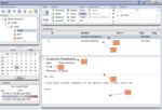
Mail View
- selected
- tr
- font-style-big-headline
- font-style-lable
- border-color-design
- defaultContainer
Setup description
After you have created and modified your theme, you should make those theme available in the configuration interface for users of the Open-Xchange Server. To do that, you only have to manifest your theme in the following server configuration file, afterwards your users can select your theme:
/opt/open-xchange/etc/groupware/settings/themes.properties
Each key in this property file must be prefixed with the theme bundle identifier. This is "com.openexchange.themes". The prefix must be followed with the unique identifier of a theme. This unique identifier specifies the directory name of the theme on the web server (/var/www/ox6/themes/ per default), too. The value of the property can be any name to described the theme. This name will be displayed in the AJAX GUI for selecting a theme. For example you should add the following line to this configuration file:
com.openexchange.themes.[YOUR_THEME_NAME]=[YOUR_THEME_DESCRIPTION]
Afterwards, restart the Open-Xchange service groupware. Your users can now select your theme.
End user view
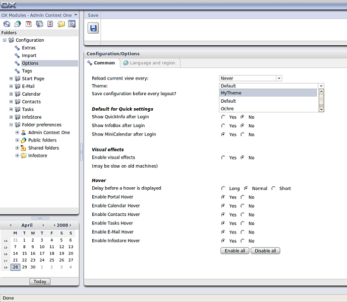
After you have created and configured your theme, your users will be able to select it in the configuration frontend:
